Flute's Prayer: an anime vs masters study
Aug. 28th, 2019 12:39 pmThis is my first color work in which I create fanart by studying the work of the "Old Masters".
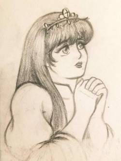
The initial sketch was done in my little sketchbook with graphite. Based on "La prière" by Jean-Baptiste Greuze. Since it seemed like a decent enough subject and not a very complex piece, I went ahead and tried to create a proper color work version.
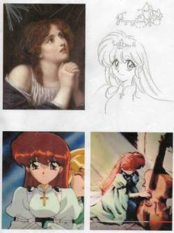
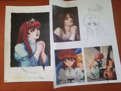
Setting aside from the master work that I'm studying from, the subject of this piece is Princess Flute from an old 90s series called The Violinist of Hameln. I used her coronation grown from the tv seriers.
I also must thank Unicornlight on dA for providing a red line.
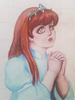
After transferring the red line to professional quality paper, it's time to start coloring. I always start with the complexion first. This allows me to blend vigorously, and I can blend in more shadows later if needed. I also normally start with pastels as a base, but for this one, I just used colored pencils.
After all the coloring is done, I just added a touch of white acrylic ink and misted it with fixative.
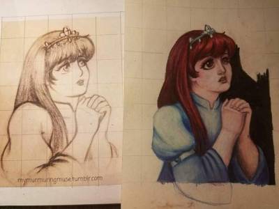
To be quite honest, the drastic style differences surprised me. I got really lucky with paper I was using as it allowed me to add layer upon layer of color. This allowed me to somewhat mimic an oil painting effect. With this, I was able to "sculpt" features that that I feel overpower my graphite and ink work. Ultimately, the final result is reflective of my favoritism of more realistic styles of animation such as the Russian animated film Prince Vladimir.
╔⊶⊶⊶⊶⊶✞⊷⊷⊷⊷⊷╗
Critique
╚⊶⊶⊶⊶⊶═⊷⊷⊷⊷⊷╝
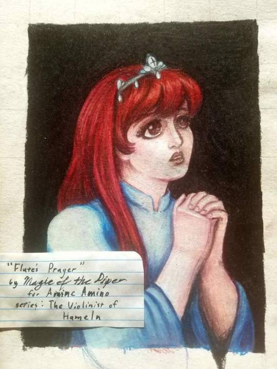
While I am overall very happy with this, I still need to work on the fundamentals. It was pointed out to me that the eyes are different sizes. This is due to a flaw in my subconcious, and I will need to practice unlearning this habit of drawing the further eye smaller in 3/4th view portraits before tackling my next master work study.
I still am conflicted about simplifying the dress. I don't regret ignoring the shoulder gems, which is a very 90s motif, but the lack of cross hanging from her neck does interfere with conveying who, and for what series, this fanart for. Still, I thought that a gold cross would of drawn too much attention towards it and away from her.
I experimented with black raspberry, rather than my usual browns, for shadows, which overall made the image appear blueish. It worked well for this piece, but I should avoid it for most future illustrations. I should also make an effort to procure more seafoam green colored pencils to match the orignal dress. The lack of yellows was fine this one time, but I will need to warm her complexion in future color works. Also, the shadows could of been more pronounced.
Lastly, I feel that her hair might be too red. I would likely use more browns next time. In this, I think she looks too much like Ariel. I understand that this is normal for anime, but this is one series that I would like to have believable hair color when doing more realistic fanart for.
✞———————❖———————✞
Thank you for your time.
Feel free to leave any criticism you may have.
The initial sketch was done in my little sketchbook with graphite. Based on "La prière" by Jean-Baptiste Greuze. Since it seemed like a decent enough subject and not a very complex piece, I went ahead and tried to create a proper color work version.
Setting aside from the master work that I'm studying from, the subject of this piece is Princess Flute from an old 90s series called The Violinist of Hameln. I used her coronation grown from the tv seriers.
I also must thank Unicornlight on dA for providing a red line.
After transferring the red line to professional quality paper, it's time to start coloring. I always start with the complexion first. This allows me to blend vigorously, and I can blend in more shadows later if needed. I also normally start with pastels as a base, but for this one, I just used colored pencils.
After all the coloring is done, I just added a touch of white acrylic ink and misted it with fixative.
To be quite honest, the drastic style differences surprised me. I got really lucky with paper I was using as it allowed me to add layer upon layer of color. This allowed me to somewhat mimic an oil painting effect. With this, I was able to "sculpt" features that that I feel overpower my graphite and ink work. Ultimately, the final result is reflective of my favoritism of more realistic styles of animation such as the Russian animated film Prince Vladimir.
╔⊶⊶⊶⊶⊶✞⊷⊷⊷⊷⊷╗
Critique
╚⊶⊶⊶⊶⊶═⊷⊷⊷⊷⊷╝
While I am overall very happy with this, I still need to work on the fundamentals. It was pointed out to me that the eyes are different sizes. This is due to a flaw in my subconcious, and I will need to practice unlearning this habit of drawing the further eye smaller in 3/4th view portraits before tackling my next master work study.
I still am conflicted about simplifying the dress. I don't regret ignoring the shoulder gems, which is a very 90s motif, but the lack of cross hanging from her neck does interfere with conveying who, and for what series, this fanart for. Still, I thought that a gold cross would of drawn too much attention towards it and away from her.
I experimented with black raspberry, rather than my usual browns, for shadows, which overall made the image appear blueish. It worked well for this piece, but I should avoid it for most future illustrations. I should also make an effort to procure more seafoam green colored pencils to match the orignal dress. The lack of yellows was fine this one time, but I will need to warm her complexion in future color works. Also, the shadows could of been more pronounced.
Lastly, I feel that her hair might be too red. I would likely use more browns next time. In this, I think she looks too much like Ariel. I understand that this is normal for anime, but this is one series that I would like to have believable hair color when doing more realistic fanart for.
✞———————❖———————✞
Thank you for your time.
Feel free to leave any criticism you may have.