Sketch

Dec. 9th, 2020 07:48 pm
magicofthepiper: (Default)
I have been background binging Working Moms on Netflix mostly to find good content to ref from. My feeling are mixed about the show itself but it does on occasion hits right in the feels.

I just really wish I felt comfortable drawing habitually because I feel like my stuff is in uncanny valley territory and I can't get over that hurdle unless I hammer out a ton of rough drawings
magicofthepiper: (Default)

FOREWORD


I need to work on gesture drawing so I've been using Quickposes for warm ups (note that it's not intended for underaged artists). And though I'm not supposed to, I was drawn towards a particular photograph.  

quickposes.com/assets/poses/3f14cfcfdaf16d210de3051252a80ee3.jpg  


Part of what I found appealing about it is the upward tilting head. It's something I struggle with my art. But with the combo of an air of arrogance in the pose matched with a black wide-brimed hat and cape, I felt compelled to redraw it with Hamel from the Violinist of Hameln.


ABOUT THE CHARACTER

Hamel is the main protagonist of The Violinist of Hameln. He is a violinist who travels across the story's fantastical Europe setting. In the orginal manga, he is an arrogant hero.


MY PROCESS

To start, this series is dear to me. I've been meaning to redesign the characters so that my fanart feels more personal. For Hamel's outfit, I take inspiration from 15th century fashion.


I use grid lines as a guide to recreate to original photo. It helps me from habitually drawing as if looking at the character straight on. I still drew the features too long to be convincing that it's supposed to be angled, but it's close enough that I didn't notice to fix it.


The first step is to draw Hamel out. The heavy reliance on a specific photo reference is apparent, as I would not say that this is my style. Though I hope to draw like this organically someday.


Now, this is probably too ambitious for my skills but I wanted to try a background. Unfortunately, I do not possess the skill to draw the perspective needed to properly convey an upward camera angle so I expect that to a trained eye, the perspective is jarring, but a street view is what I wanted to practice.


The background took a lot of time, and probably more detailed than needed. But I wanted to draw from photo reference and not from Ghibli films. Hopefully, I'll learn to simplify backgrounds with practice, but right now, it's more important to learn what a traditional German house looks like rather than capturing the essence of one. I made sure to snap a picture of it after drawing in all the details, as I will be going over it with a kneaded eraser to lift excess graphite to soften the image.


https://66.media.tumblr.com/00e452647a772a91ea37925fbc4156de/2016ea890e8df739-9e/s540x810/9203339bec0284f14a8a62e50ddb6adf08ee225a.jpg


While the sketch and background were drawn in graphite, for Hamel, I used black Prismacolor pencils. I was lucky to have both a regular and a fine line pencil at hand. The fine line has harder lead and is more difficult to get dark even when pressing, while the regular easily darkens the page. This allows me to alternate between the two for constrast.


I had initially intended to stop at the above image. But when I made a scanned copy, I noticed that lack of values in the face made it less dynamic than the reference. Do I went back and added more.


This gave me the chance to sculpt the face a bit more which I think improved this piece.


CRITICISM

The closer to realism a style is, the more critical one tends to be about their older work. I expect to hate this in the future, but it was first and foremost a study to push me out of my comfort zone.


I had hoped that since the pose was a relaxed one, I could allow it to develop naturally. Instead, the placement of the arms are stiff and awkward. This is a reminder of the importance of proper posing even in a simple portrait in creating good art.


Thank you for reading.

Any criticism is appreciated.

magicofthepiper: (Default)
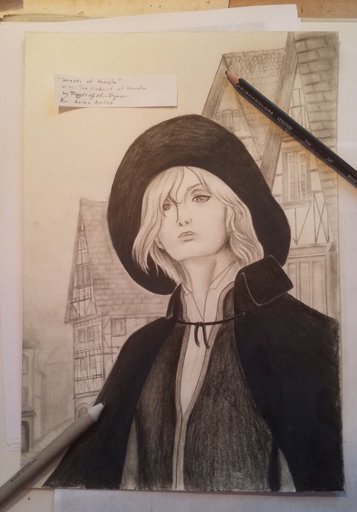
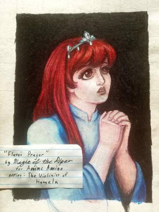
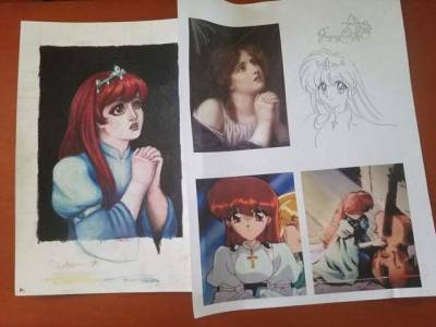
Deedlit from Record of Lodoss War won my "Who Should I Draw?" poll on Anime Amino.

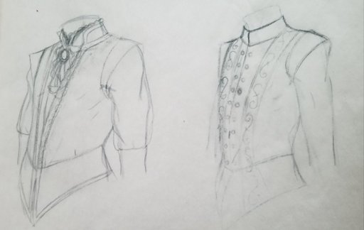
I decided to use avoid drawing her armor and used the clothing design from the online game art.
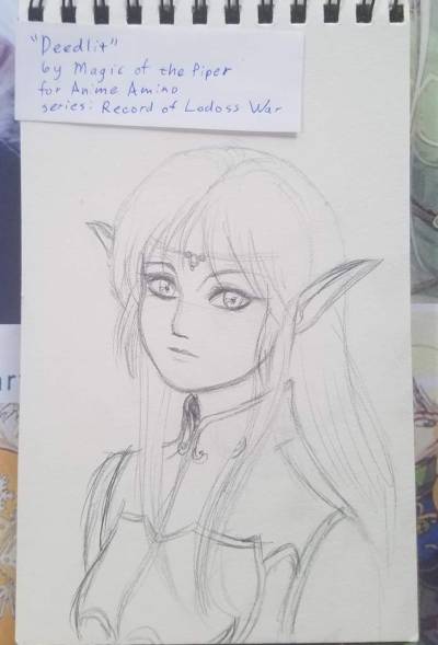
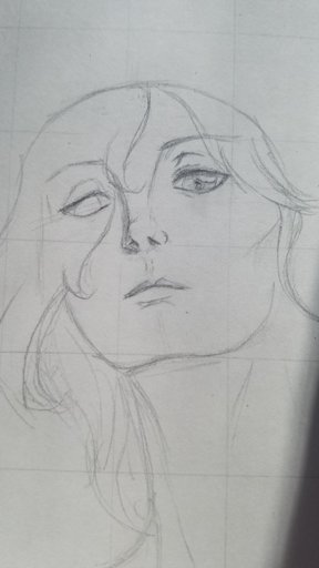
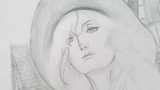
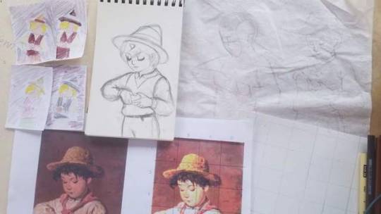
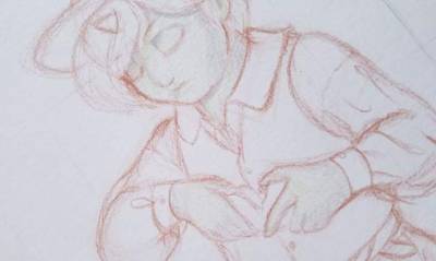
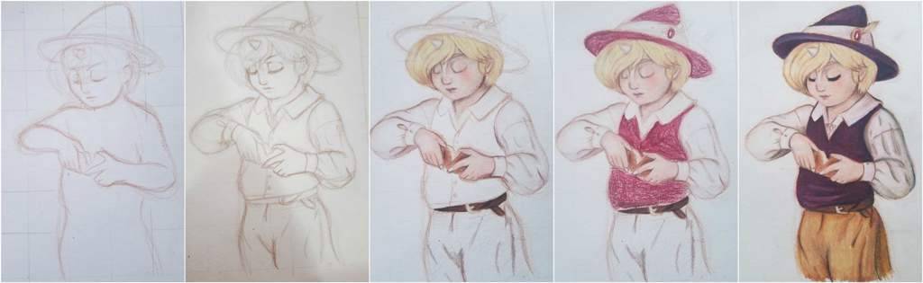
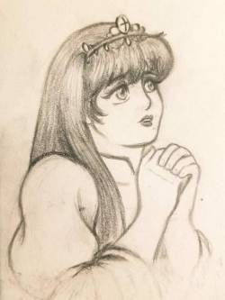
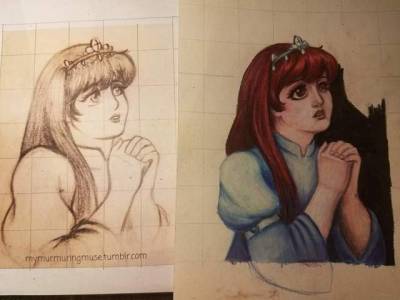
Initial Sketch
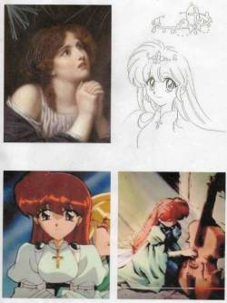
For references, I used stock from Liancary-art, as well as official art and considered using Mucha as inspiration. I also blew up a scan of the initial sketch because I hope to avoid issues I had with my Yue piece. I should probably rely more heavily on recreating my initial sketches rather than doing freehand.

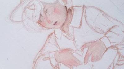
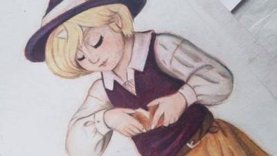
Sketch and References
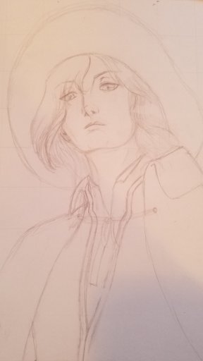
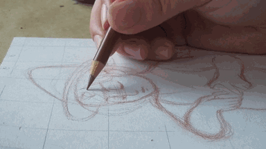
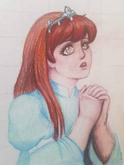
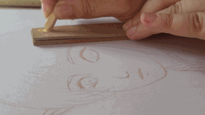
Gridding is my preferred method of transferring. A better artist could probably recreate by eye alone, but gridding helps me keep proportions right and notice smaller details such as angles while also allowing me to consciously modify things that I don't feel worked well in the original. In this piece, I'll reshape Deedlit's left ear because it is too lateral in the initial sketch.
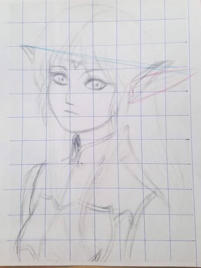
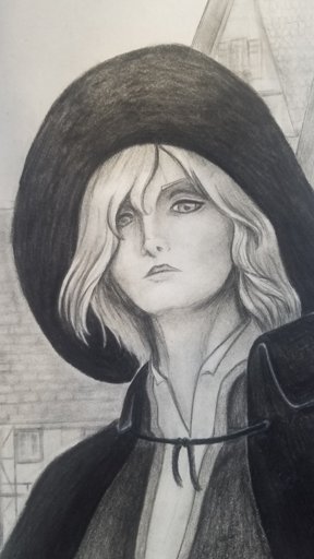

Gridded Reference
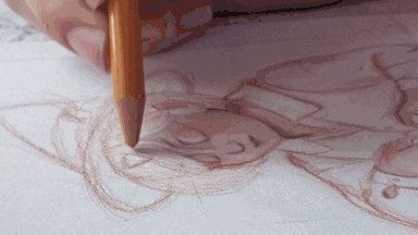
With my grid guide, I redraw the image.

:MATERIALS:

Strathmore Bristol

Prismacolor nupastels

Prismacolor color pencils

Acrylic Ink

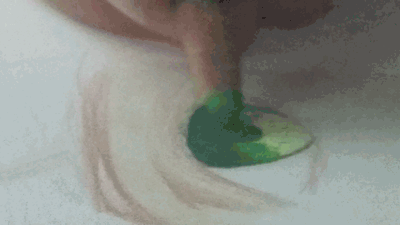
Bristol board isn't a very convenient canvas for the blend-heavy technique that I favor for colored pencils. To compensate this, I use chalk pastels for my base.

To lay a smoother layer on, I first grind the dust with sandpaper. The sandpaper I use is from a Staedtler Sandpaper Lead Pointer, which come with 12 small sheets of paper.

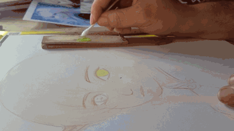
I then apply it with a q-tip. This prevents pressure streaks from applying the chalk directly and avoid the chalk mixing with the oils from my skin if I were to apply it with my fingers.


Pastel Base
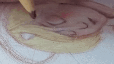
With the base colors in place, I can now begin to add details with color pencils. I prefer using wax pencils over pastel because the wax binder keeps the colors in place.


I'm a bit weary of using heavy blending on Bristol, but I was recently watching Shinigami Arts' videos, and I've decided to try blending the colors more on this piece.


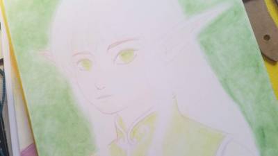
So far, I'm happy with how the skin and eyes are coming along.


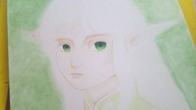
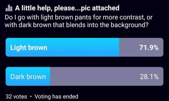
I was tempted to leave her hair pastel, but I decided that I should try to make it yellow. I'm starting to regret that decision. If anyone mistakes the character for Link, I can't even be bothered by it because at this point I stand back and think, "This is Link".


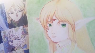
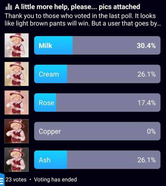
There are a few reasons for this. Firstly, the "sideburns" are the wrong style. I should have made them shorter, thinner, and curled towards the face. Second, I went with a blond I'm familiar with; composed of "cream", "goldenrod", and "light brown". What I should of done is mixed the cream with greys instead. If I needed more yellows, I could then add "canary yellow", though I should probably go out and see if I can buy "lemon yellow" for future use.


After sleeping on it, I decided to erase and redraw the sideburns. It's not as nice as if I had been closer to canon from the start, but hopefully it looks more like it's suppose to.


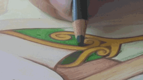
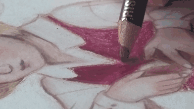
Next, I colored in the clothes. Despite my reservations about using colored pencils on Bristol, the colors laid on nicely. It's not perfect, but I like the texture, it reminds me of felt, though ideally it should probably resemble silk.


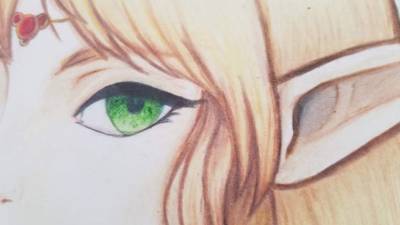
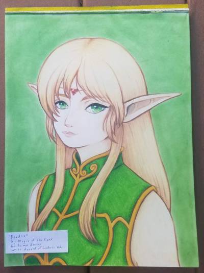
To finish the coloring of the subject, I finished Deedlit's left ear. I didn't mention this before, but since I'm right handed, I tried to work from left to right as much as possible. This is probably why I tend to favor 3/4ths view facing viewer's left. Lastly, I added black for the lashes. I avoided using black for most of the image. I used a little in the inner ear, and the pupil of the eyes but I mostly reserved it for the eyelashes. For everything else the darkest color is "dark brown" and "blue indigo".


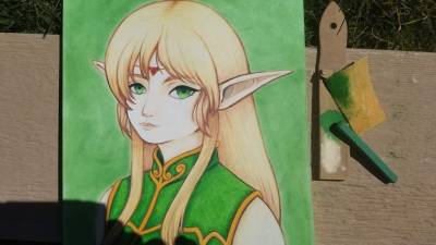
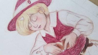
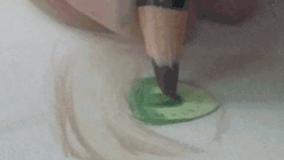
Since it was a beautiful day outside, I took my work outside to finish the background. I made the background more pigmented by grinding the pastels above the paper, and rubbing the color in with a fragment of chamois. Afterwards, everything is sprayed with fixitive and left to dry.


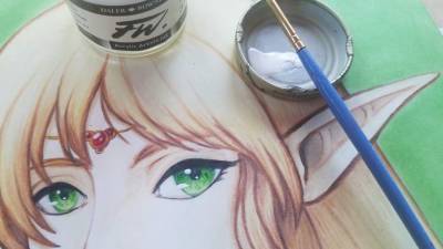
Lastly, I add a touch of white acrylic ink to create highlights on the gemstones and eyes.


Overall, I'm happy with the final result. It took more time than I would of liked for a simple portrait, but it might be one of my better works.

Thank you for reading.

Feel free to leave criticism.
magicofthepiper: (Default)

This is a sketch of Hamel from The Violinist of Hameln based off an old painting by an artist who is only known by his signature "Rossi". It's a simple painting but I liked it and it seemed like a good piece to practice from. During the sketch process, I was conflicted with whether I should lean towards the manga or the anime canon as inspiration. I started out with anime inspired, with Hamel in Staccato Village, but as I continued, it became more manga inspired.


References: Rossi's "Boy with bread", official character sheets, screencap.
Part of what made me favor using the manga's canon was the tilt of the hat. I feel that it's important to the composition, so I wanted to keep it as is, but it affects my decision on how I draw the character. In the anime, Hamel's horn is hidden by glamour, but it's a significant part of the character's identification. However, the age of the character presented here might be an issue for manga readers. In my personal revision of the manga canon, I push the timing of the Anthem Massacre of occurring later in Hamel's life, so I don't really mind, but others might.


Hamel's childhood design from the manga
Changing to the manga does help with clothing options. While the anime tries to appear to adhere to a medival setting, the manga varies greatly in where it draws inspiration. It can visually appear to be set anywhere between the fall of Rome to 1999. The clothes that Hamel wears as a child in the manga look to be from about the 1920s at earliest.


First steps: reference, grid guides, traces, sketch, colored thumbnails
To start, here are my preliminaries for setting up my composition. I have my reference, a higher contrast and gridded copy, and traces, one contour and an anatomical breakdown. I have a freehanded sketch of the character in the pose and thumbnail of color concepts.

Gif of the sketching of the primary outline
My materials for this will be Canson Drawing paper and colored pencils, primarily prismacolor. This will lean towards earthy tones, so I'll use light brown for my base sketch. I start by referring the original, and then referring my sketch, trying to recreate the best parts of each.


Coloring: Flesh undertones
I'm going to experiment with this piece with "French Grey 20%" and "Pale Sage" as the first layer of flesh. The green is supposed to help create a more realistic flesh tone. I've had mixed results with the technique.


Coloring: Ruddy complexion
Remember the days back when "tumblr style" meant the characters looked like they had cold? I still think that adding a ruddy complexion is a sign of youthfulness. The green seems to have blended in well.

Gif of adding "goldenrod" to where the hair be colored in.
This is a series full of blondes. In the manga illustrations, everyone has the same shade of yellow. But there's actually a lot of nuance to blonde colors.

Gif of adding "dark brown" to outline hair
I need to practice to match the right type of blonde and be able to recreate it, but for this piece I decided to go with a pale blonde, composed mostly of "cream" with touches of "goldenrod" and "dark brown".

Gif of adding "tuscan red" to vest
This might be a controversial decision, but I don't think Hamel's canon black and white outfit was ideal for this piece. I opted to go with red-tinted vest and hat.


Coloring process: Red vest
Since I was moving away from the canon color pallet, I decided to use brown colored pants. I asked for help from the community with a poll on Anime Amino.

Poll results: Light Brown - 71.,9%, Dark Brown - 28.1%
In that poll a user by the name of Howl Pendragon brought up valid criticism that I was using too much brown. Therefore. I decided to host another poll to decide the background.

Poll results: Milk white won by a slim margin over Cream yellow and Ash Grey
While no option won by a large margin, absolutely no one seemed to like the brown bg option. Ultimately white seems to have won. I'll be basing the white grunge texture off this image:

Stock image of Irish cottage house with white painted walls
Before that though, the point of having a red vest and hat was to help the character stand out against a dark background, now that I'm going with a white one, I wanted to go darker.


Coloring process: A darker vest
So, I layered "true blue" and "indigo blue" over the red. It succeeded in darkening it, but it does leave a purplish hue. This hue does look closer to the canon, but it does bother me because purple is associated with royalty, and Hamel is a very impoverished commoner. Still, it's not as vivid as lenten purple, and creates some impression of mixed fiber, so it's probably fine.


A collage documenting my process from sketch to color
At this point I'm happy with the subject, now to try a background.


Tracing the outline of my suject
I didn't intend to have a shadow, but having a faint shadow should help to create the impression that Hamel is inside somewhere, making the image feel more finished than if I left it blank. Rather than eye the shadow, I used tracing paper to trace the contour of the subject, rubbed grey on the other side and traced the lines again to recreate an outline to fill in.


Coloring process: Adding a drop shadow
I then tried to create a grunge background and I'm done.


Final: Young Hamel Breaking Bread

Side by Side of Rossi's Boy with Bread and my fanart of Hamel with Bread

Criticism:


I need to work on getting used to drawing the head at different tilts. I don't feel like tilted Hamel's head far down enough. It was also supposed to be a simple exercise but it took too long. I should probably practice different color pallets so I can feel more comfortable with manipulating Hamel's black and white colour scheme.

I should also practice interiors. I'm not too happy with the background on this. More practice with interior settings should help me better capture a cozy atmosphere.

But overall, I'm content with this piece.

Any additional criticism is appreciated.

Thank you for reading.


magicofthepiper: (Default)
This is my first color work in which I create fanart by studying the work of the "Old Masters".


Initial sketch: Based on "La prire" by Jean-Baptiste Greuze.
The initial sketch was done in my little sketchbook with graphite. Based on "La prière" by Jean-Baptiste Greuze. Since it seemed like a decent enough subject and not a very complex piece, I went ahead and tried to create a proper color work version.


My references: "La prire" by Jean-Baptiste Greuze, official character design sheet, screenshots.
Setting aside from the master work that I'm studying from, the subject of this piece is Princess Flute from an old 90s series called The Violinist of Hameln. I used her coronation grown from the tv seriers.

I also must thank Unicornlight on dA for providing a red line.


WIP: First layers of color.
After transferring the red line to professional quality paper, it's time to start coloring. I always start with the complexion first. This allows me to blend vigorously, and I can blend in more shadows later if needed. I also normally start with pastels as a base, but for this one, I just used colored pencils.


Final Version
After all the coloring is done, I just added a touch of white acrylic ink and misted it with fixative.


A copy of the sketch with the WIP for comparison.
To be quite honest, the drastic style differences surprised me. I got really lucky with paper I was using as it allowed me to add layer upon layer of color. This allowed me to somewhat mimic an oil painting effect. With this, I was able to "sculpt" features that that I feel overpower my graphite and ink work. Ultimately, the final result is reflective of my favoritism of more realistic styles of animation such as the Russian animated film Prince Vladimir.


Final with references for comparison.
╔⊶⊶⊶⊶⊶✞⊷⊷⊷⊷⊷╗

Critique

╚⊶⊶⊶⊶⊶═⊷⊷⊷⊷⊷╝

While I am overall very happy with this, I still need to work on the fundamentals. It was pointed out to me that the eyes are different sizes. This is due to a flaw in my subconcious, and I will need to practice unlearning this habit of drawing the further eye smaller in 3/4th view portraits before tackling my next master work study.

I still am conflicted about simplifying the dress. I don't regret ignoring the shoulder gems, which is a very 90s motif, but the lack of cross hanging from her neck does interfere with conveying who, and for what series, this fanart for. Still, I thought that a gold cross would of drawn too much attention towards it and away from her.

I experimented with black raspberry, rather than my usual browns, for shadows, which overall made the image appear blueish. It worked well for this piece, but I should avoid it for most future illustrations. I should also make an effort to procure more seafoam green colored pencils to match the orignal dress. The lack of yellows was fine this one time, but I will need to warm her complexion in future color works. Also, the shadows could of been more pronounced.

Lastly, I feel that her hair might be too red. I would likely use more browns next time. In this, I think she looks too much like Ariel. I understand that this is normal for anime, but this is one series that I would like to have believable hair color when doing more realistic fanart for.

✞———————❖———————✞

Thank you for your time.

Feel free to leave any criticism you may have.

Profile

magicofthepiper: (Default)
magicofthepiper

February 2025

S M T W T F S
      1
2345678
9101112131415
16171819202122
232425262728 

Syndicate

RSS Atom

Style Credit

Expand Cut Tags

No cut tags
Page generated Jul. 9th, 2025 11:06 am
Powered by Dreamwidth Studios